
Case STudy: Branding |
Client: University of Michigan Division of Pain Research
Project: Identity Design Deliverables: Logo Mark; Typography; Letterhead; Color Palette |
A unique challenge in this project was its name changing after early logo proofs had been delivered and feedback had been given. Below, the path to the final logo is shown and discussed.
|
Early Representations of Ascension and Development
The team at the Back and Pain Center was in mid-development of a training program designed for staff and trainees in the Division of Pain Research, working toward enhancing their research and professional development skills. |
|
|
|
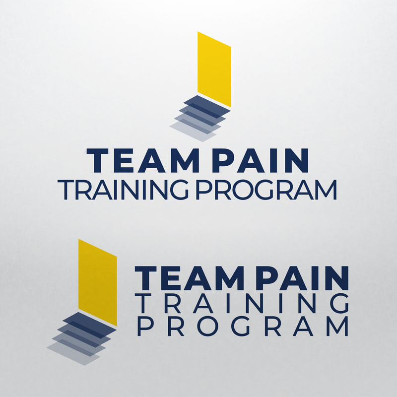
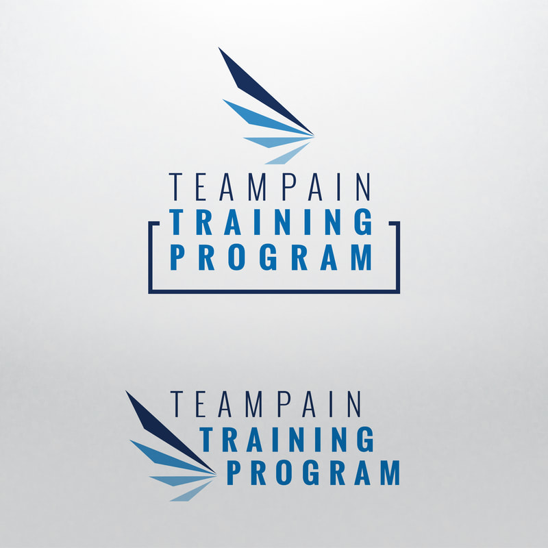
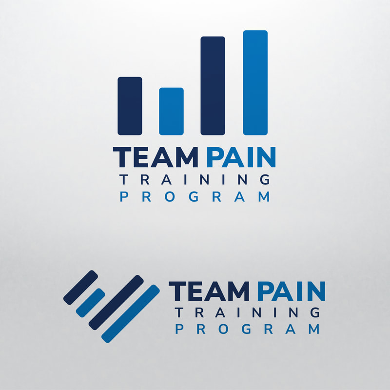
Early concepts focused on the idea of elevation, in some cases depicting stairs or sequential steps upward, aiming at defining bold, recognizable shapes, and reflecting an innovative approach to training.
|
|
|
|
New Name and Further Exploration
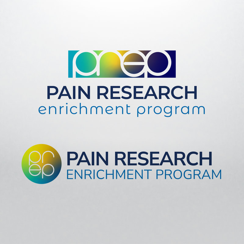
Changing to the new name, Pain Research Enrichment Program (PREP), some of the original favorites were adapted. But new concepts were also explored, beginning with a custom letter-mark and adopting some gradients from the University's tertiary color palette. The initial brand design evolved to better-reflect this new name and new directions were explored further. |
|
From these new concepts and taking the feedback given to this point, a new mark was identified as a front-runner and expanded out into a basic logo set. This new logo set is built around the icon/lettermark of PREP, which depict a sprouting flower - a perfect representation of the aims of the program.
Final Logo and Lockup
