Branding an app
Branding is an immense topic, and under its umbrella you will find a plethora of components and considearations that all (hopefully) work together in support of the larger brand. One important piece of a brand is its visual identity. You can think of the logo as the face of a brand. It's the mark that you are meant to remember.
Is the brand identity visible in more than just its logo? Does it convey the thoughts and feelings you get when you think of the company, product, industry it is a part of? Is it clear and memorable? Is it unique?
These are the things I think about when working on a brand identity. The logo mark is where I begin this journey.
|
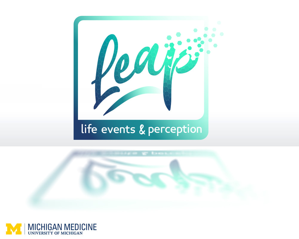
In the Mobile Technologies course, I found myself with an excellent opportunity to begin a key contribution to a future project that I have discussed with the creators of the PREP program at University of Michigan, with whom I have worked on several other projects since 2018.
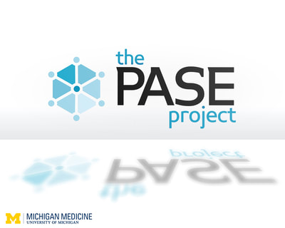
This set of 3 logo pitches were primarily created for this course, but one will also serve as the identity for an app they are developing as a pain-patient habit encouragement and tracking tool. Other work I have done with this team can be seen in this case study, in which the process of rebranding the training program is discussed, as well as the PASE Project logo and Life Events and Perception study.
|
|
